Voice & Accent Certification Introduction Class Tonight — Starts in
Voice & Accent Certification Introduction Class Tonight — Starts in
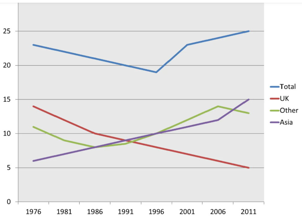
Cambridge Veritas Dynamic Presentations


.png)